
OVERVIEW: Long time client High Fidelity Property Management needed a brand mark created for their new addition...a Real Estate Brokerage Business. Below I share my process and how I strategically connected the dots to get to the solution.
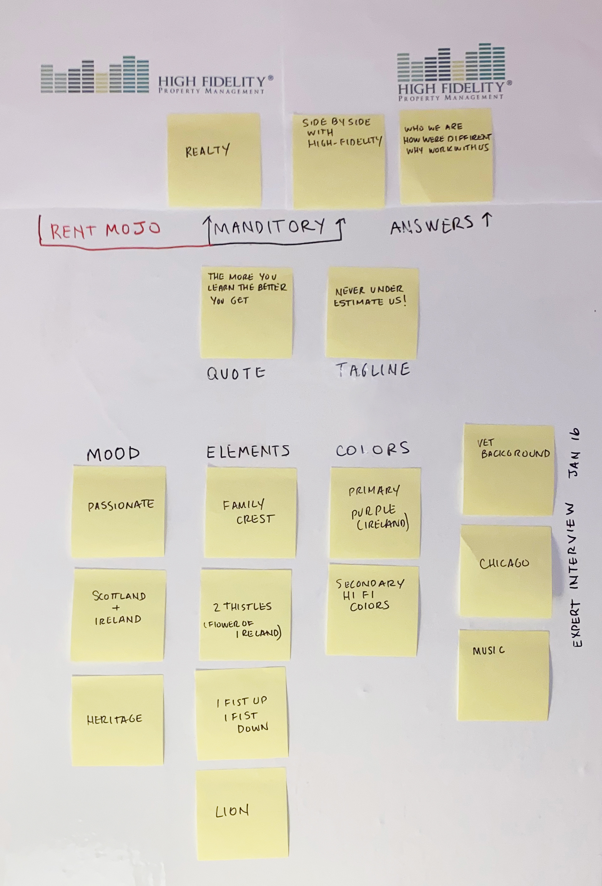
THE CALL: A phone conversation with the owner was the first step in gathering the information needed to create a logo that could meet his goals and fulfill his vision.
• What things should the logo convey?
• What are the mandatories?
Has to live side by side with existing sister companies logo
Needed to say Realty
The client had many thoughts and direction for the logo to reflect is heritage and passion for Ireland and the colors Purple and Green (High Fidelity Property Management color)
Tagline provided, Never Underestimate Us
THE AFFINITY BOARD: Captured the distilled notes and have them into one location
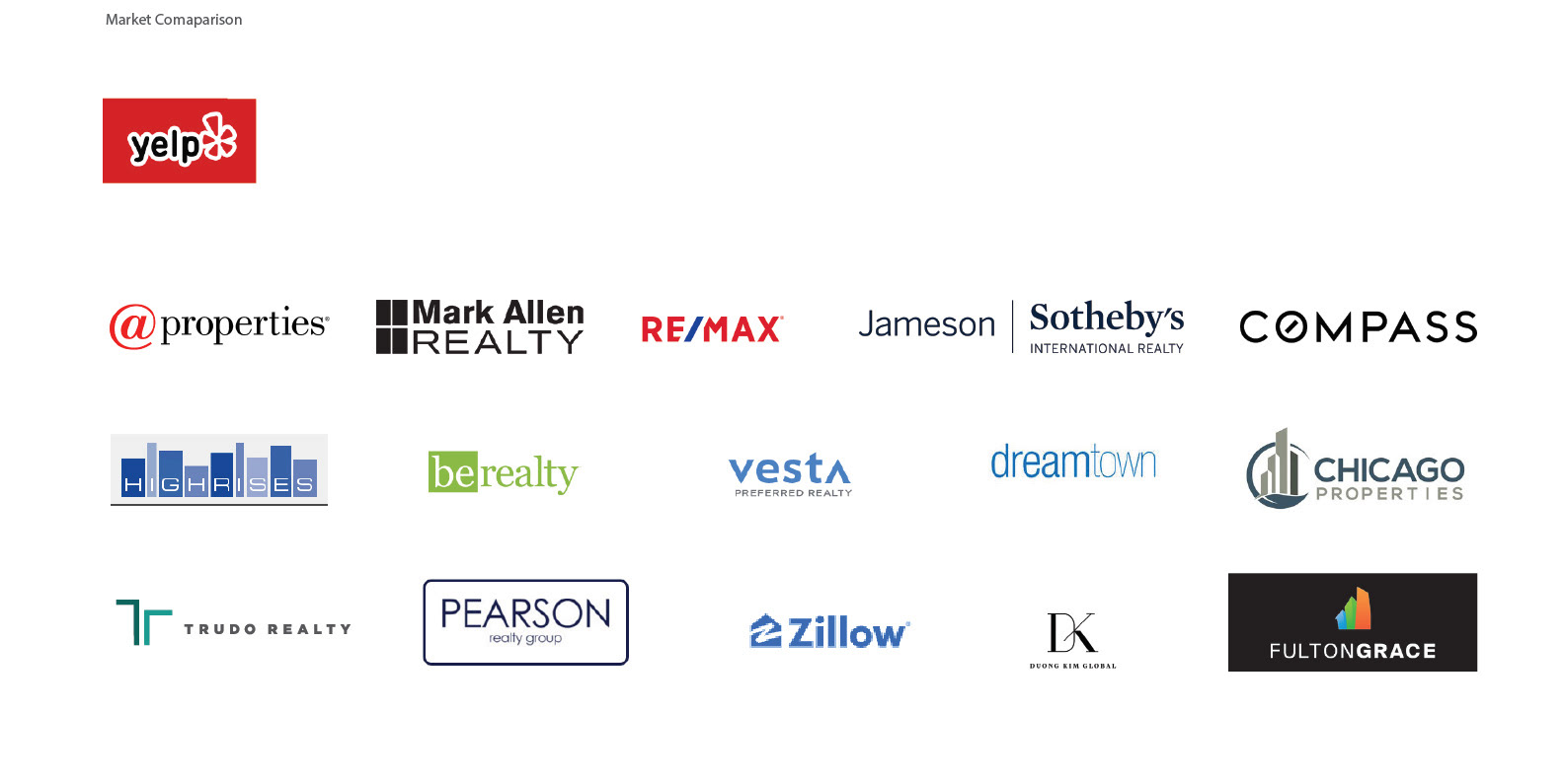
MARKET RESEARCH: A search on Yelp provided observation of other Real Estate professionals and Real Estate Companies within the same Market. This condensed and easy to digest page helped formulate a realistic landscape where the logo would live.
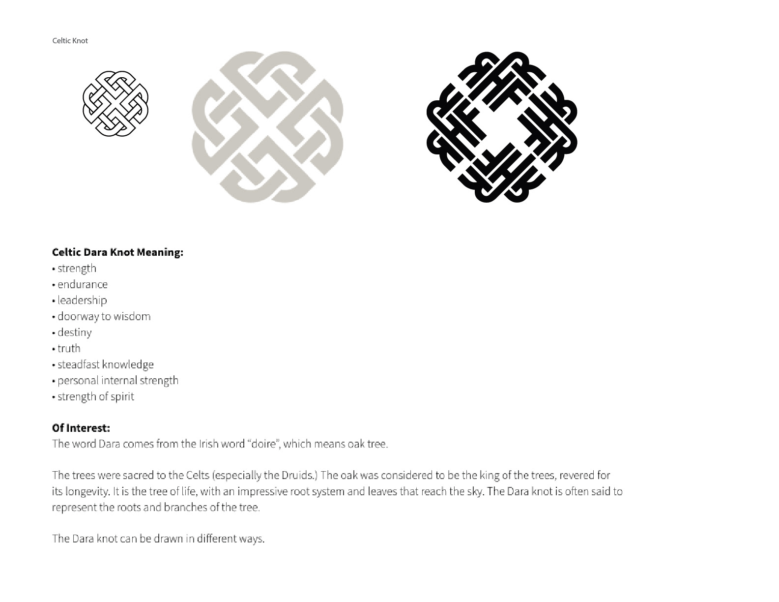
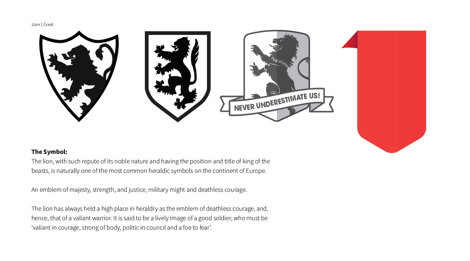
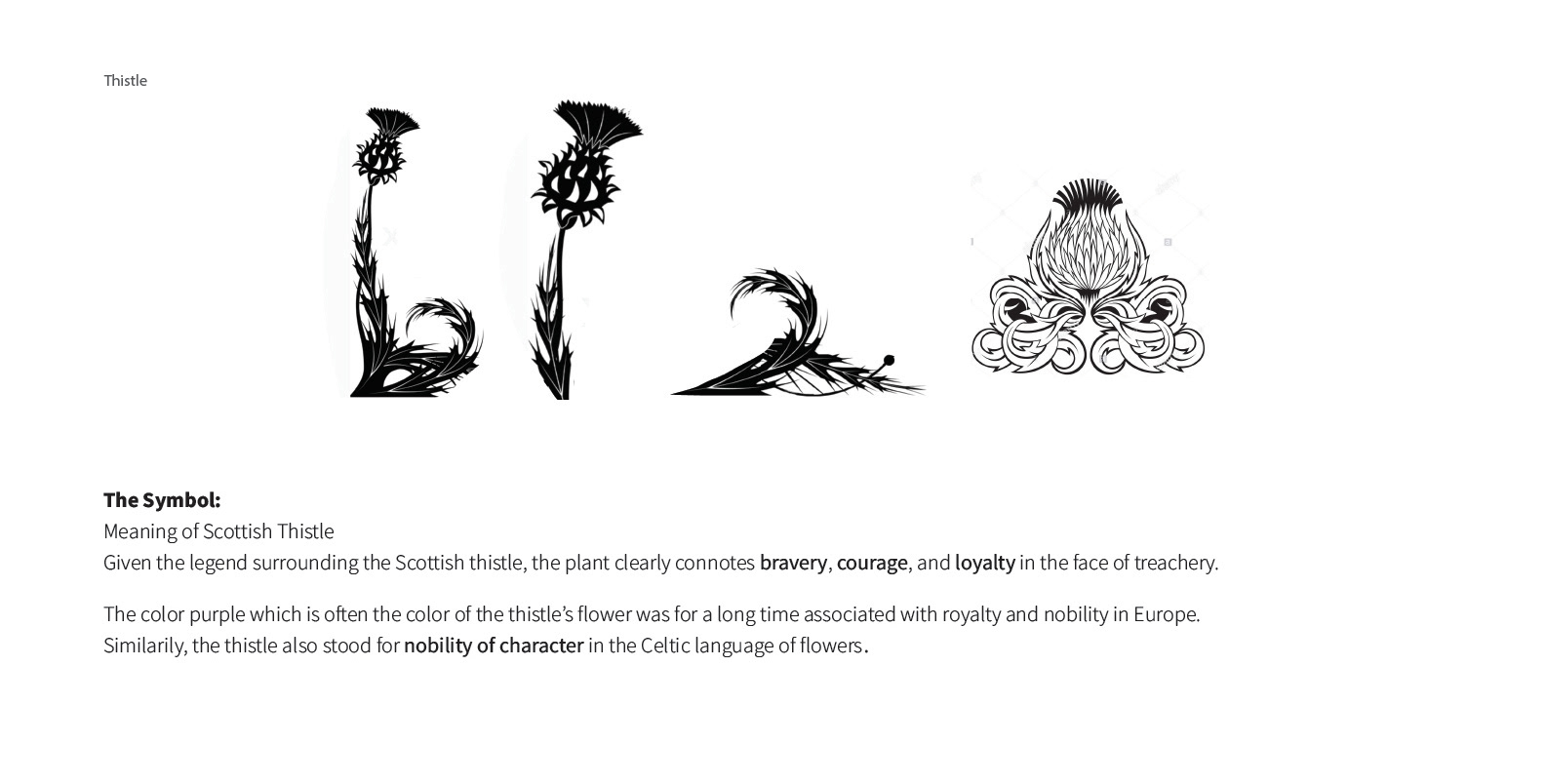
INSPIRATION: The search for inspiration began. Vector based websites pulling family crests, shields thistles and off the cuff spotted a Celtic knot. Sketching began and slicing in illustrator to combine components to fit the request.
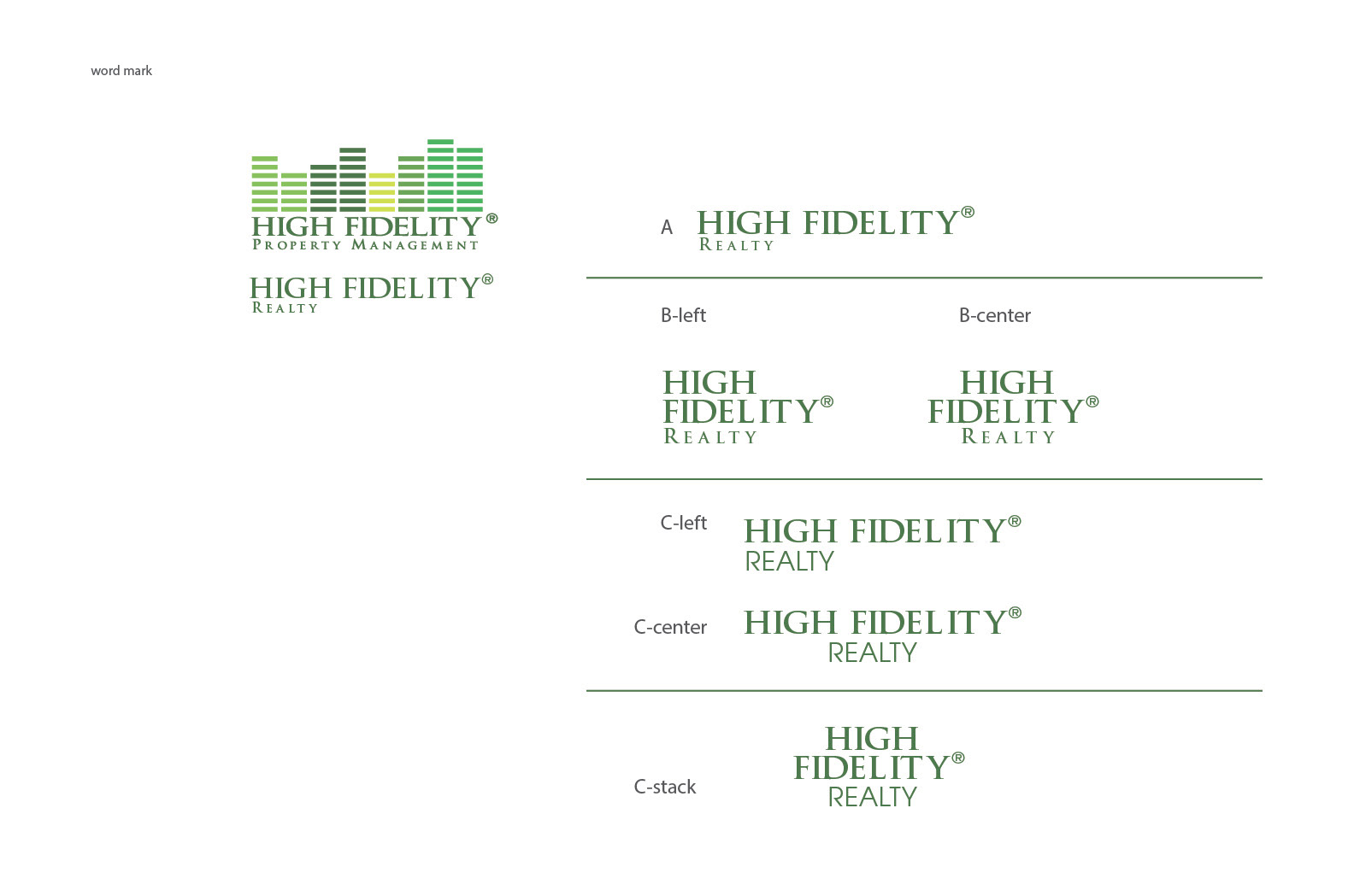
Presentation: The presentation included the Infinity Board (featured above), Market Research and Word Mark and variations. Three concepts based on the goals communicated along with written meaning of the symbols that tied back to the objective.
PRESENTATION jan 19 ______________________
CONCEPT 1 ______________________
CONCEPT 2 ______________________
CONCEPT 3 ______________________
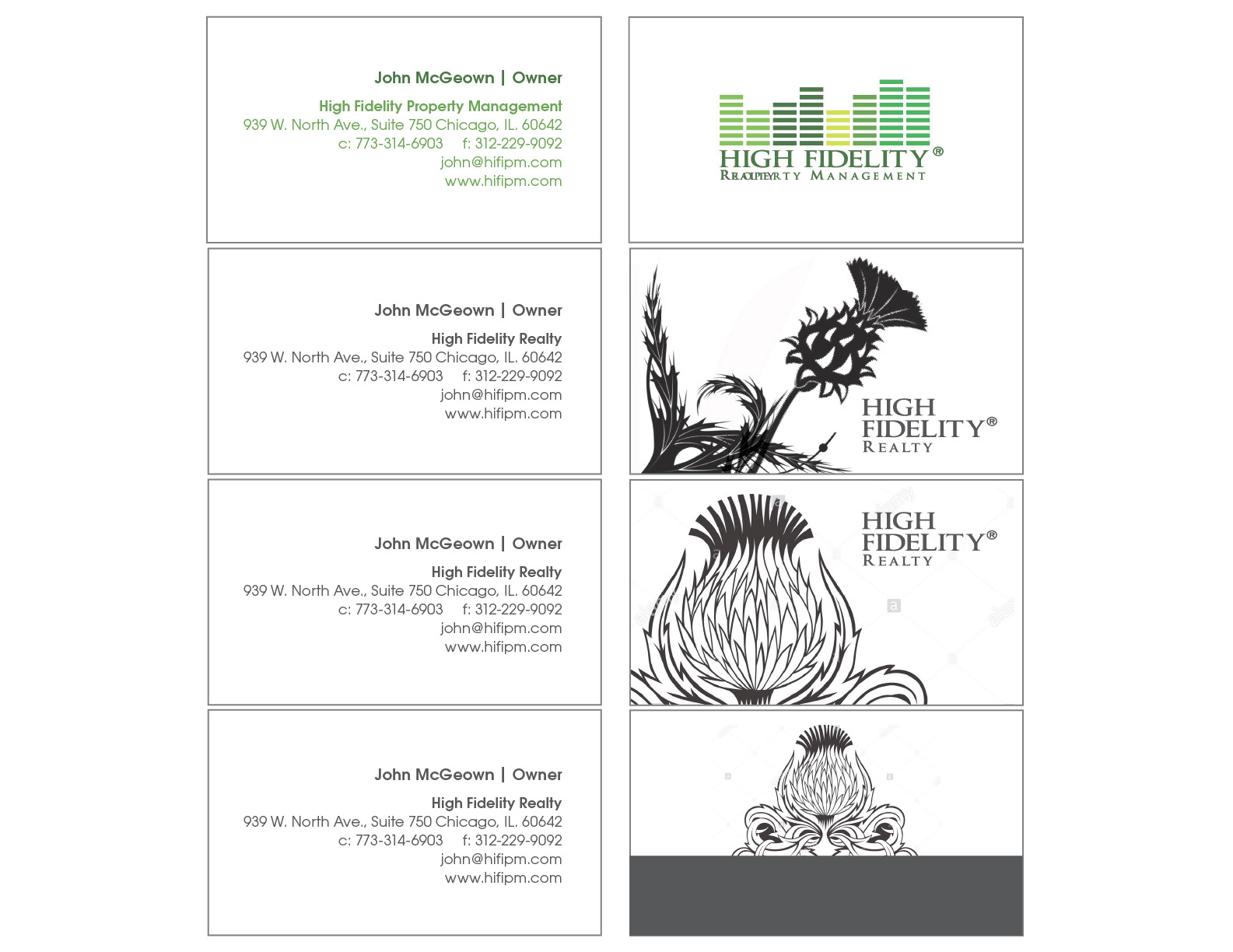
DIRECTION CHOSEN: The client approved the knot version created with the letters.
• Revise the tagline to always moving
• Remove circle R
• Next phase COLOR
• Revise the tagline to always moving
• Remove circle R
• Next phase COLOR
PRESENTATION jan 20 ______________________
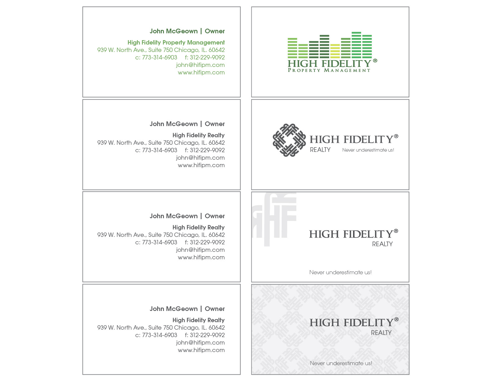
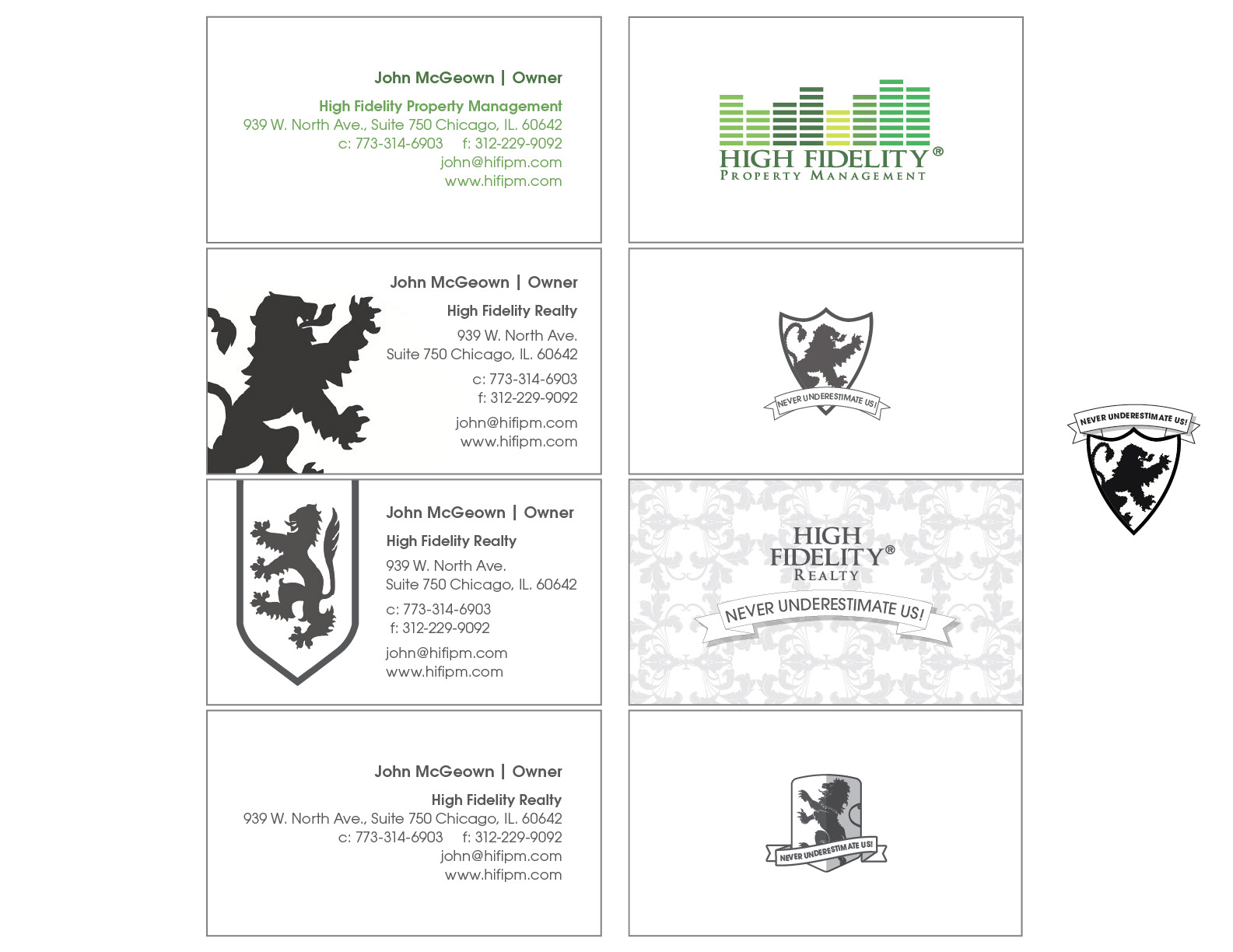
CARD WITH COLOR: Presented side by side of Property Management Card
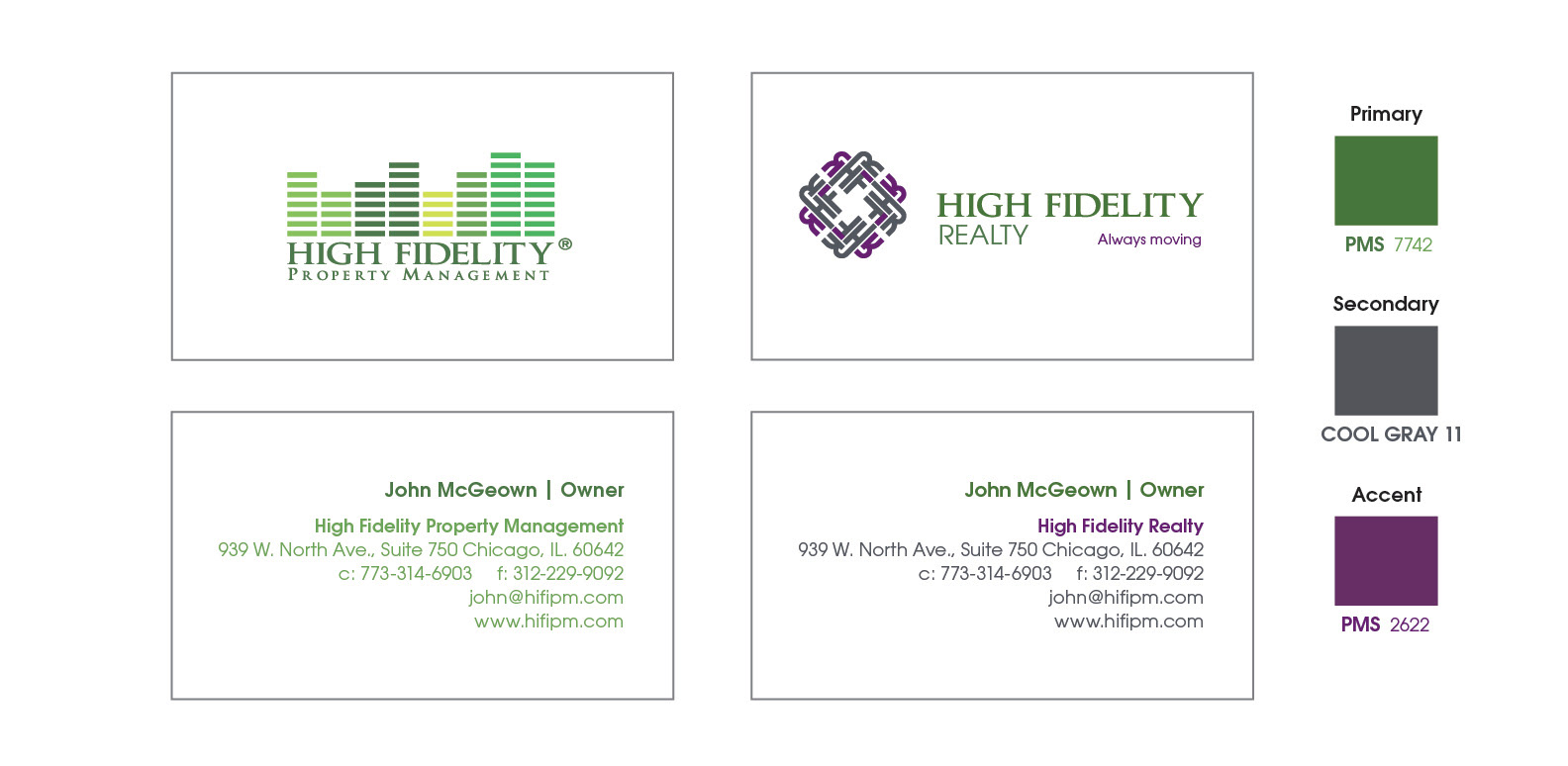
CLIENT REDIRECT: The client decision to use the Celtic Knot without using the letters.
Also taking into account these points:
• go towards the Celtic knot, tie (look / feel) to decibel pieces
• no violet / purple…use the 5 greens from Property Management Logo
• use same fonts / colors as the Property Management side of the business
• remove always moving, no tagline used
Also taking into account these points:
• go towards the Celtic knot, tie (look / feel) to decibel pieces
• no violet / purple…use the 5 greens from Property Management Logo
• use same fonts / colors as the Property Management side of the business
• remove always moving, no tagline used
PRESENTATION jan 21 ______________________
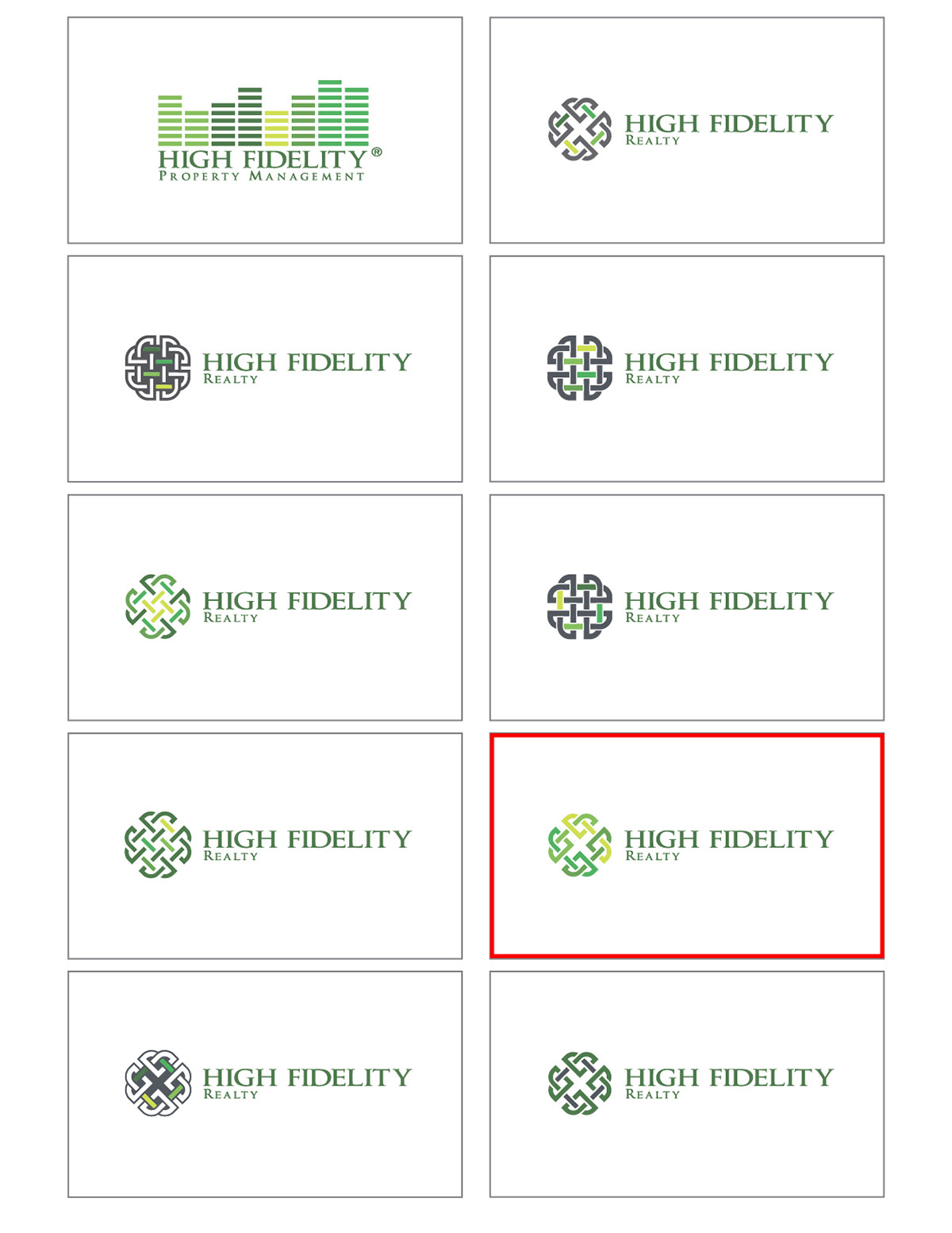
DIRECTION CHOSEN: The client approved the knot version highlighted above.
Next steps, production for Card, envelope and 2 different size signs
Next steps, production for Card, envelope and 2 different size signs
jan 22 ______________________
CLIENT REDIRECT: The concept is no longer a consideration, after reviewing the competitive research board again, we are moving into a simpler shape solution